Branding
Pimienta & Romero
The Concept: Where Wellness Meets Gourmet
Pimienta & Romero was born with a clear mission: to prove that healthy eating can—and should—be a gourmet experience. Originally launched as a Dark Kitchen, the brand needed a visual identity that could communicate "fresh and healthy" while simultaneously triggering the "crave-ability" of a high-end restaurant.
The name itself reflects this balance: Pimienta (Spice/Boldness) and Romero (Herb/Freshness). My goal was to design a brand that appeals to both the senses and personal well-being, moving away from the clinical look of traditional health food and toward a "tasteful wellness" lifestyle.
My Role: Crafting a Multi-Sensory Brand
As Art Director and Designer, I built the brand’s visual foundation to ensure it stood out in a competitive digital-first market:
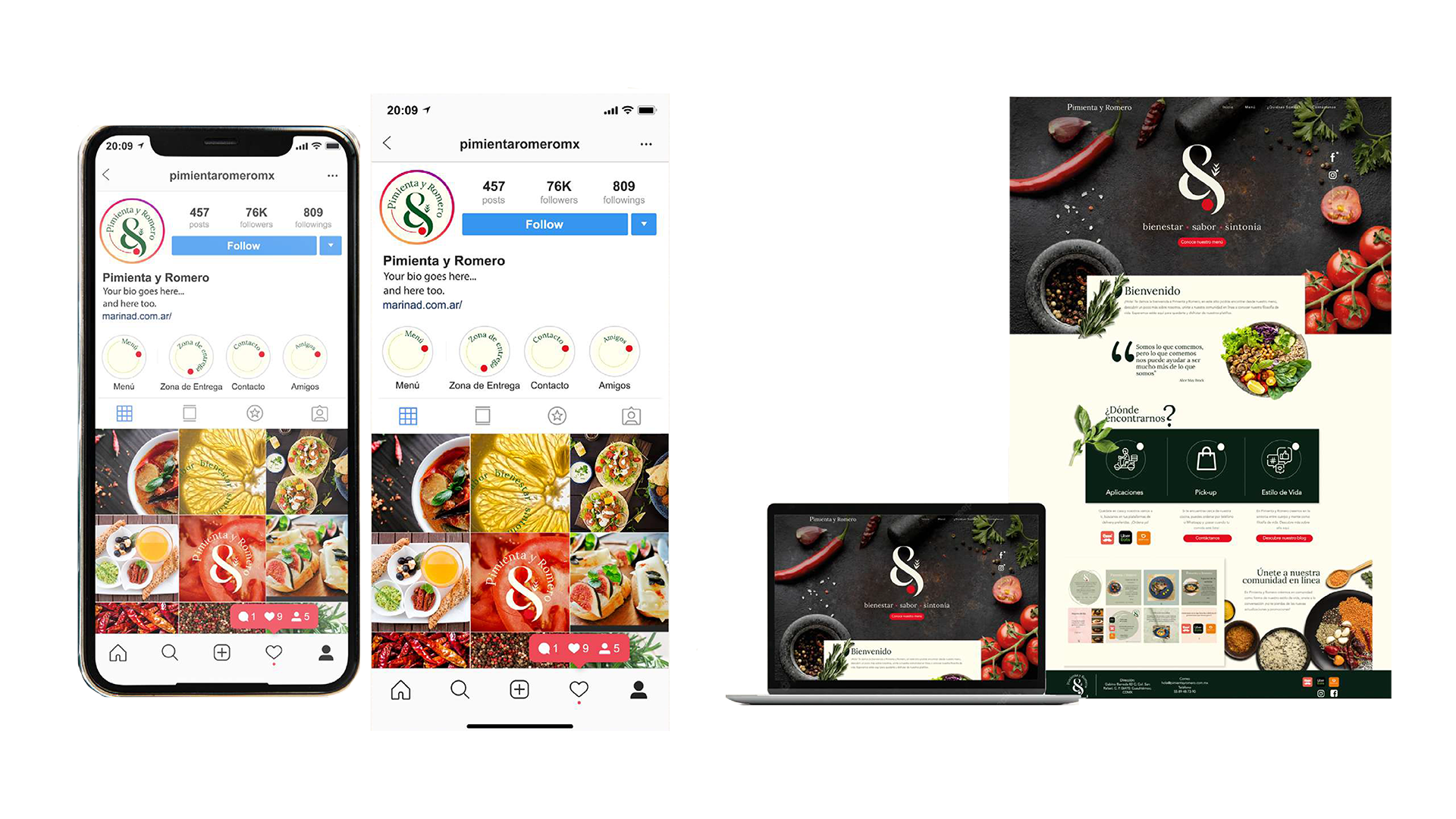
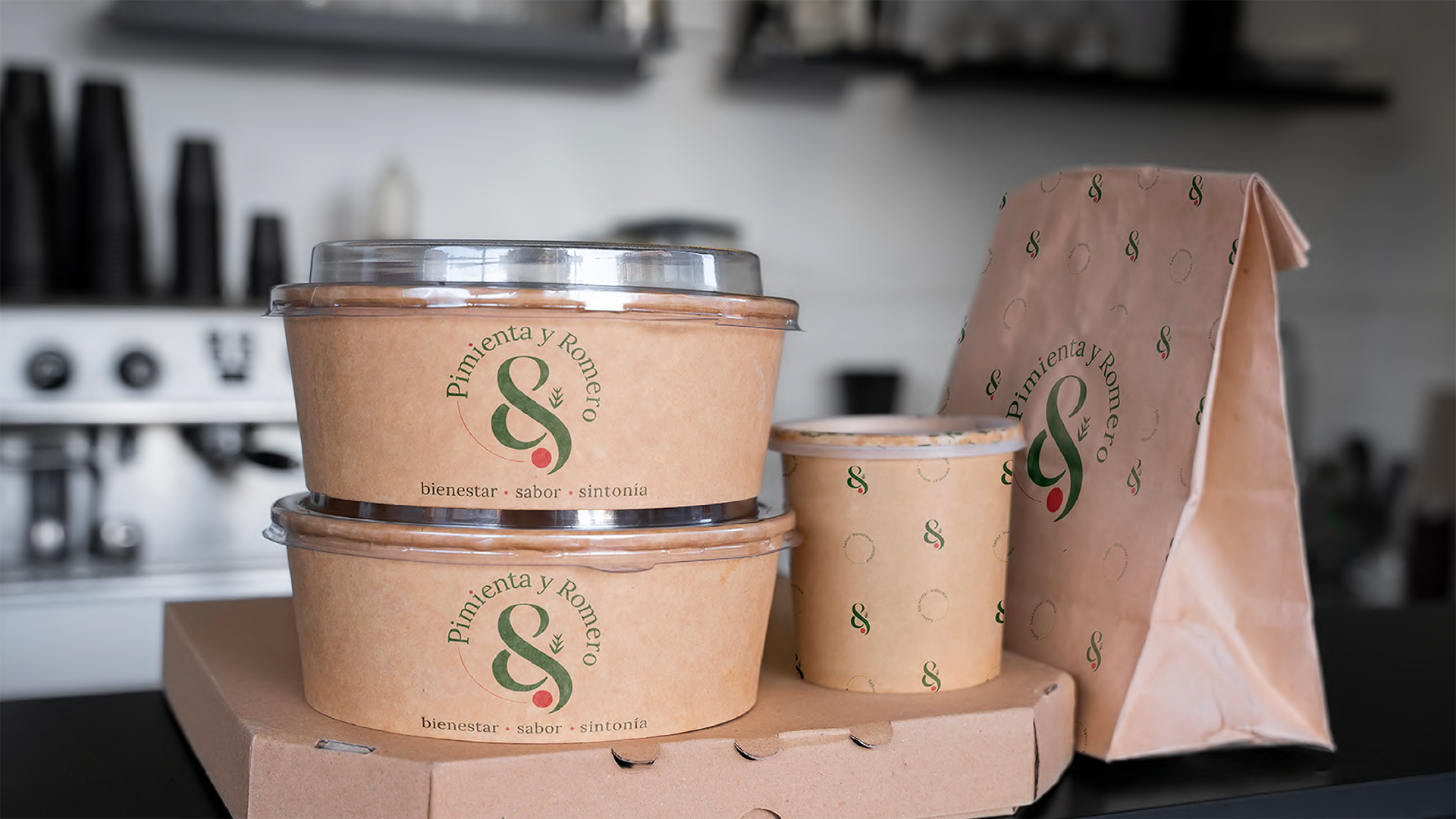
Brand Identity & Visual Storytelling: I developed a sophisticated visual language that balances "Wellness" and "Tastefulness."I chose a palette and typography that feel organic yet premium, positioning the brand as a gourmet choice for those who don't want to compromise on flavor.
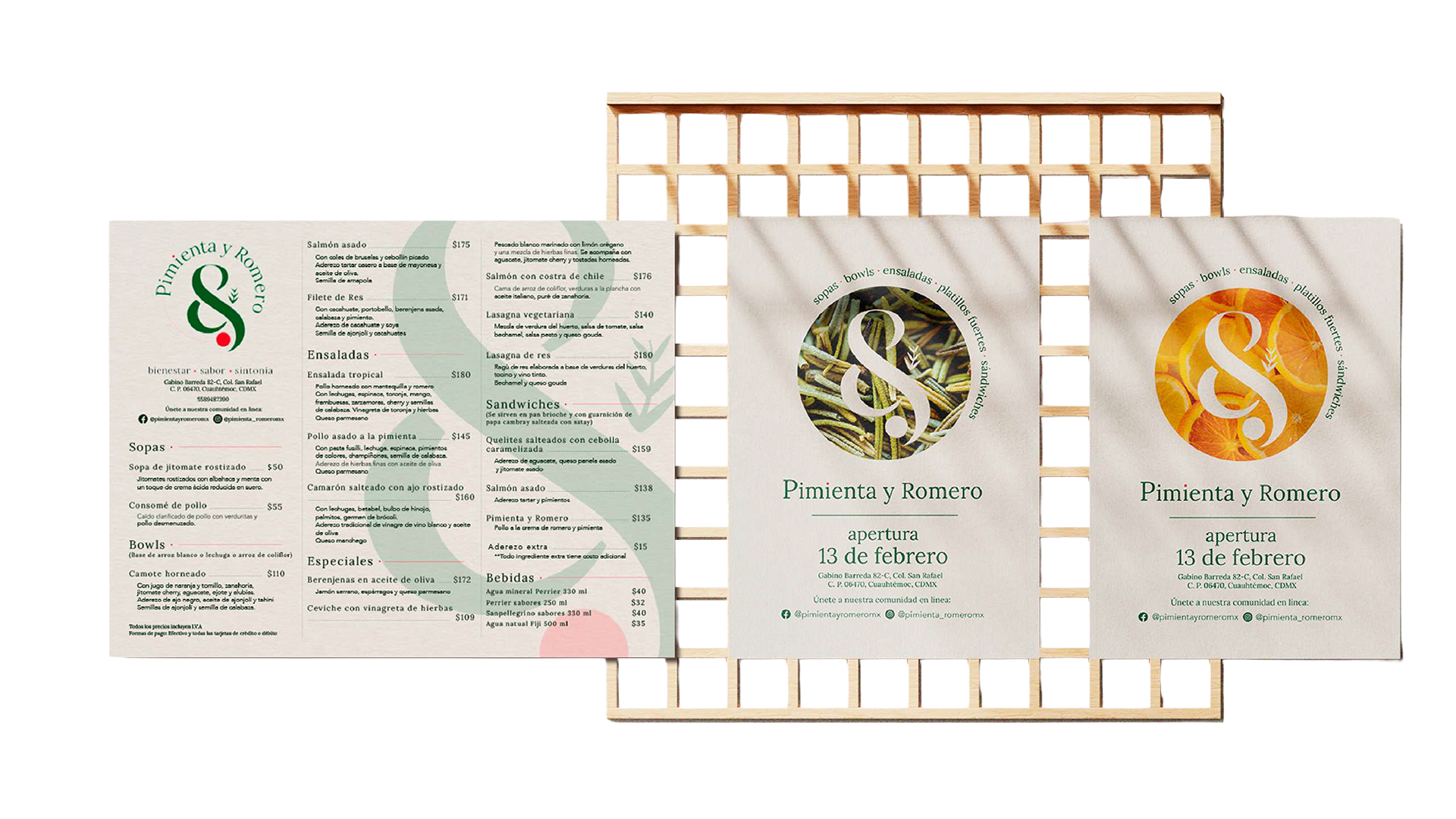
Editorial & Menu Design: I designed the digital and physical touchpoints with a focus on appetite appeal. By using clean layouts and strategic hierarchy, I made sure the ingredients and the "health benefits" were presented as a luxury experience rather than a dietary restriction.
Content Strategy & Art Direction:I supervised the visual style of the brand's photography and social media presence. The focus was on "sensory experience"—capturing the textures and vibrant colors of the dishes to ensure the audience could almost "taste" the freshness through the screen.